A bit of context
Often clients or other designers ask us how we work, what our process is, and what they can expect from the UX level of a project. So far, we haven't had two identical cases. Every process depends on a product, target audience, stage of an idea and even the client-team approach. We have our framework which we personalize to every case. Let's share with you one of our exciting stories.

The number one button in the Internet
Imagine there is a first-class product that is the first in Google search results and is used by companies such as Mixpanel, Hopin, or Hubspot. But based on the website it's hard to say what this product does. Half of the features are difficult to localize and use when you open the app. How is it possible that a product with all these issues is so successful?
OMG, can you imagine what it could be with an improved user experience?!
This is exactly what happened to us with a project for AddEvent. Their product helps to share events and calendars using an add-to-calendar button, embeddable widgets and RSVP and subscriber tools.
It's a tool designed for users setting up events and developers looking to automate these actions with a pre-made solution. The client's product team has a strong tech focus and a good understanding of user experience. However, as they added more enhancements and features, both the app and website became overly complicated.
Growing SaaS workflow
Actually, it's the usual story of evolving from a simple and great idea into an advanced tool. You are scaling the product step by step, adding more complex features. Eventually, a minimalistic UI stops working due to the new number of links, embedded editing options, and complex navigation.
We faced a challenging solution to design. Similar issues occurred with the website, where many features were very similar to each other, making it difficult to distinguish the differences. Therefore, we needed to rethink it together and figure out the communication strategy from the perspective of a new user who arrives at the website after searching for 'the best add to calendar button'.

Evolution or revolution? Redesign strategy
To make the website and app more user-friendly, we:
- Reframed the whole user journey and target audience concept.
- Completely redesigned UX and UI for the website.
- Completely redesigned the app which originally resembled the standard Calendar app, to a more useful and powerful event manager app which created a sassier and cleaner experience.
- Conducted user testings for both new website and app.
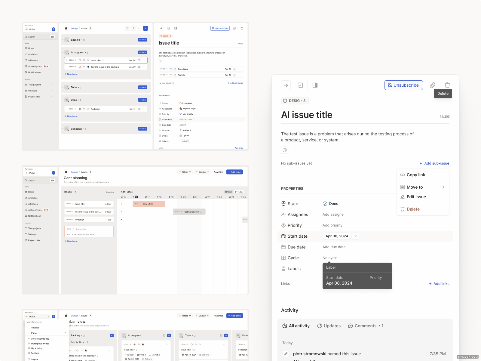
UX design process for product discovery
Remote workshop week
Discussions around redesign can take forever, and when you split them into sprints or parts, it's very common that the designer doesn't have a full context and know all features and how they can be combined.
To avoid this, we conduct product discovery workshops, which work pretty well for both new product ideas and redesigns. We had 5 days of workshops to review what was going on in the app, why they thought a complete redesign was so badly needed, and how their users' lives looked at that time

Research
During one week we spent 20 hours on the calls, and 20 hours on offline work for additional analysis like:
- UX expert review; to have an initial list of issues upfront.
- Analytics data review as mouse events – the app focuses more on actions around a few main screens, so pages analytics didn't bring too much context. To explore it more, we used the Heap app to check clicks and possible user flows without tagging all events in Google Tag Manager.
- Competitors and market review.
- Benchmarks review for both website and app.

Workshop agenda
Day one is always a business – context day to talk about the business model, value proposition, target audience and competitors. The following days we spend analyzing the user journey from the first visit to the website to advance actions done in the app, brainstorming, building user stories, sketching and specifying requirements.
Using a FigJam or Miro board with all these details, it's so much easier for other team members to get into the project. In this case, workshops were helpful for the client’s team too – as they helped them understand their product better and to look at it more from a user perspective than from the inside.
Example of this is:
- We knew that their users come from marketing, event planning, content creation, and development backgrounds. Still, we need to consider how different the motivations, expectations, and languages are for each of these groups.
- We needed clear explanations for both non-tech users and developers, making it clear on the UI which features require coding to apply and which are completely code-free.

Product design
Less talking, more drawing ideas
For this project, details and explorations took on the role of the main character. We created around 500 concept screens, including 150 final ones. We also explored over 30 versions of the hero section for the homepage and 10 for the initial dashboard view of the app.
Widelab's collaboration principles, including weekly syncs and daily feedback, have fostered a strong partnership with the client during our collaboration on AddEvent for over a year.

Visual UI: Let it shine
While working on concepts, we moved step-by-step from the initial UX discovery layer to visual, polishing every detail to make the app both emotionally and aesthetically attractive. We were focused on the scalability of the UI. The result was minimalistic, with a dev-friendly style supported by a basic design system setup. During user testing, we got great feedback about the new UI being great and clean. Users loved colour labelling and keeping everything in a structured order.


User testing: Will it rock?
It is always the most exciting moment of the project – after hours spent on discussions and designing, we can't wait to get to know what users think! For the AddEvent project, we conducted user testing sessions for the website and redesigned app.
When it comes to targeting and screening participants, for the website, we focused on the experience of new visitors that fit the defined personas' profiles. For the app, we tested with a set of existing customers as well as completely new users.
For one of the iterations, we recruited participants within 24 hours. That's another point: user tests don't have to exceed your budget or disrupt tight timelines. The main goal is to make the most out of them.